
Productivity in the workplace isn't just about workflow and task management; the psychology of color also plays a crucial role in enhancing mood, energy levels, and efficiency. Understanding the science behind color choices can be a game-changer. In this article, we explore this topic further, simplifying the transformation to a dynamic office environment.
The psychology of color
Are you the type of person who associates colors with kids' drawings, or someone who loves to make colorful choices in clothing and furniture? Everyone who is content with white walls and the status quo needs to rethink. Colors have a significant impact on how we feel and act.
Human beings are complex creatures, and our brains are wired to respond differently to our surroundings. Colors can serve as a road map in nature; both animals and plants use different hues to attract mates or repel threats. Colors can indicate if berries and plants are poisonous and their level of nutrients. Colorful vegetables like tomatoes and carrots are generally packed with more vitamins than a dull potato.
Historically, colors have been linked to spiritual beliefs and national pride. No wonder there are so many different flags and symbols. People like to belong and ultimately broadcast to outsiders what they stand for.
Color psychology is interdisciplinary, based on research about human behavior and cognitive processes. Neuroscience, design, marketing, and aesthetics play a part in analyzing how people are affected by different colors. Especially in marketing, colors can influence customer behavior in terms of websites, social media graphics, business cards, and posters. In UX design, the color green means “continue” and red means “stop.” Most people have similar references, but gender, nationality, and culture can affect how we interpret colors.
So, what does this mean for the modern workplace?
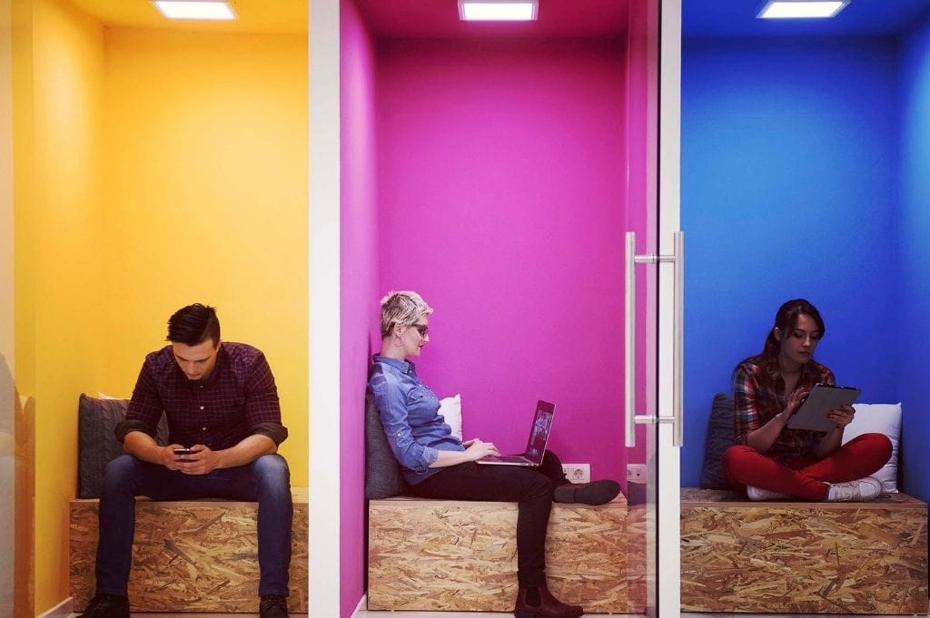
A study by the University of Texas states that colors impact the brain and can boost employees' mood and energy levels. By examining three colors—white, red, and pastel blue-green—and how they affect workers in the office, researcher Nancy Kwallek was able to form a theory that supports what companies have been suspecting for years: the use of colors has the potential to positively impact the office environment and should not be overlooked.


The impact of colors in the modern workplace
When deciding on colors for the office, it is important to consider both employees and external clients. A company brand that attracts the right clients and stakeholders is key, but it's also essential to create a calm and inviting environment that boosts productivity. This is especially important for hybrid workers who need the same level of comfort in both the home office and company office to be effective.
People evaluate their surroundings quickly when entering a new space, and hues play an important role in making a great first impression. Aligning the company brand and logo with the colors in the office is a great idea, as it creates coherence and memorability.
Employee satisfaction is crucial since satisfied employees are more likely to work harder to reach company goals. This reduces the chances of employees experiencing burnout or fatigue. You eliminate the risk of having to look for temps to cover for absent employees or constantly hiring new staff, which is a huge expense. Additionally, happy employees are more likely to recommend the workplace to other ambitious professionals, attracting more talent overall.
Read the summary below to find out what the use of different colors can do for your company:
Productivity: By introducing specific hues to certain spaces, you can inspire employees to think more creatively or create a serene and inspiring environment.
Mood: Do you want calmer and more relaxed employees? Try colors like blue or green. Pink is also said to reduce aggressive behavior and foster a stronger community where people take care of each other.
Branding: Different colors have the power to create various associations linked to the company brand. Do you want to come across as innovative and progressive, or serious and reliable?
Wayfinding: By dividing the workspace into distinct areas, it is easier to navigate. This minimizes confusion for both visitors and stressed employees trying to find their way. Another positive aspect is that neurodivergent people feel more at ease when there is less chaos and confusion.
Office design - what colors should you choose?
So many colors, so many options. If you are looking to give the office a makeover, it is easy to get carried away, since there are so many variables to consider. You do want to avoid an entirely white office, since it gives a sterile and boring impression.
Beige
Choosing beige hues are the best way to be on trend now, and interior magazines and Instagram feeds are full of beige interior pieces and furniture. Beige is regarded as a classy and earthy color that is easy to match with other colors, both calmer tones as green, but also accent colors like pink or orange.
If you are looking for a timeless office interior, neutral colors are the way to go. The great thing about beige is that it does not draw unnecessary attention, which means that people have an easier time focusing.
Just make sure to not go overboard, as it tends to get a bit dull and basic.
Gray
Gray is similar to beige, but is more of a classic choice. It is considered to be more business friendly, since it signals sophistication and intellect. You often see dark gray suits and clothes on lawyers or salespeople.
Gray tends to keep emotions neutral, which is perfect in settings when you don’t want biases to affect how we work.
Orange
Did you know that orange is the favorite color of Buddhist monks? No wonder! They are devoted and constantly searching for answers, both within themselves and the outside world.
Orange is a warm and energetic hue that instantly draws attention. It is particularly great for learning materials in conferences and briefings.
Red
The color red is usually linked to passion and romance, and strong emotions such as anger. Red roses are the most common choice when celebrating your love on Valentine’s Day.
Ruby hues are also linked to strength and power, hence the color of the Porsche brand, which instantly makes us think of roaring engines and high speed.
Red can also be controversial in some settings and be regarded as an interfering element. You don’t get married in red, but rather in white, which traditionally was intended to signal purity and chastity. Wedding guests are encouraged to not show up in a strong red color to draw attention from the bride.
Blue
Blue is a serene and sincere color, which happens to be many people’s favorite. A blue tone can bring calm vibes, but can also signify grief or longing. Picasso was known for is “blue period” where he painted dreamy paintings, sparked by the death of a dear friend.
Done right, blue is truly a classic color choice which is easily matched with other colors. Royal blue looks powerful and sincere, and tones of petrol or turquoise are fun and stylish.
A law firm or accountant agency looks good with blue interiors and rustic wooden furniture.
Yellow
Did you know that yellow can increase joy and creativity in the room? It makes us feel bright and warm, like a ray of sunshine.
A yellow color would be a perfect option in a meeting room where people brainstorm and collaborate. Likewise, a creative agency would enjoy a colorful office with bright, yellow hues.
Green
When we connect with nature, we instantly feel more in tune with our selves and are able to breathe deeply. The green hues are part of the equation, which is why green is a popular option.
Besides bringing zen to the office, it is also considered evoking friendliness and trust. In hospitals, the light green color is the preferred option to make people feel more at ease in the clinical and dull environment.
In the office, the soothing color green is a great choice in a work space where people need to concentrate or a small lunch/lounge room where people take breaks to recharge.

Incorporating colors in the office
There are different ways to incorporate more colors in the office. Everything from wall paint to couches can be more colorful. Recently, bolder choices of wall paint have been favored among interior designers, with hues such as sage green, plum, olive green, and dusty pink. A bold move would be to combine a colorful room with colorful furniture as well, whereas others prefer not to color block and go with a more discreet option.
Colors like red and orange can be harder to incorporate, as they don’t always go well with every piece of furniture. One idea is to use posters, fabrics, and curtains in these colors. Green is probably the simplest color to use in the office since you can rely on plants to work their magic.
A stylish office space is great for business
While some may think of colors as mere aesthetics, their impact goes much deeper, influencing cognitive processes and behaviors. Research shows that specific hues can enhance creativity, foster calm, and boost productivity. Why not give it a try? Paint some walls or buy a new office couch—it's up to you!

Want guidance on how to set up your hybrid office for success?
Feel free to schedule a meeting with one of our product experts to learn more about our solutions and how technology can help you streamline your office processes without interfering with employees' day-to-day work.